Catch: Surf App for Apple Watch
Enabling surfers to catch the perfect wave
Overview
Problem: Surfers struggle to catch the perfect wave in the water. Surfers don’t have an ability to have current data on water conditions while they are in the ocean. A single mistake in your placement in the water can become tiring especially for beginner surfers. Not understanding the swells can also be a safety hazard for surfers just learning.
“It can be scary when you’re not placed in the right area of the ocean surfing. If you don’t know what you’re doing out there you can get hurt, or worst injure others... ”
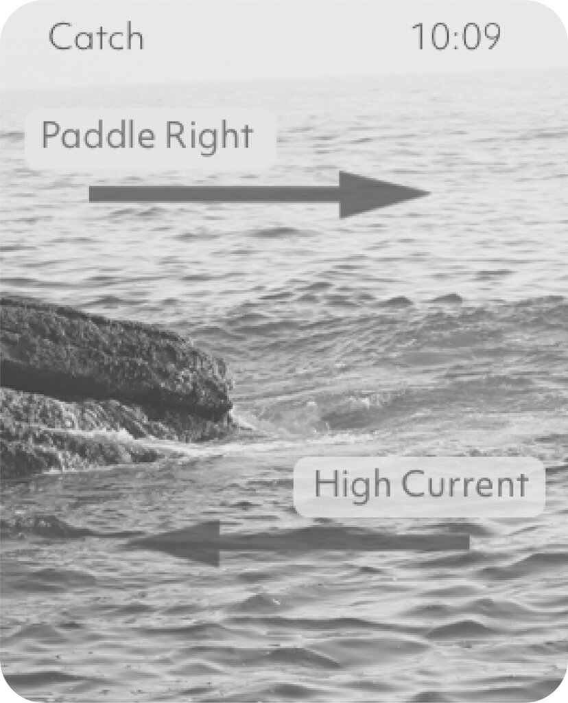
Solution: The app forecasts swell recommendations for the user by utilizing forecast data from satellites, ocean wave models, sensors and reporters. It enables the surfer to position themselves in the water to provide detailed guidance on where to surf and catch waves.
My Role: Product Designer & UX Researcher
Design tools: Sketch | InVision | Illustrator | Photoshop | AfterEffects
Approach:
Research
Field observation | Task analysis | Interviews | Affinity mapping | Personas | Journey mapping | Competitive analysis
Design
Informed brainstorming | Sketching | Design Alternatives | User feedback | Wireframes | Interactive prototypes
Evaluate
Cognitive walkthrough | Usability testing
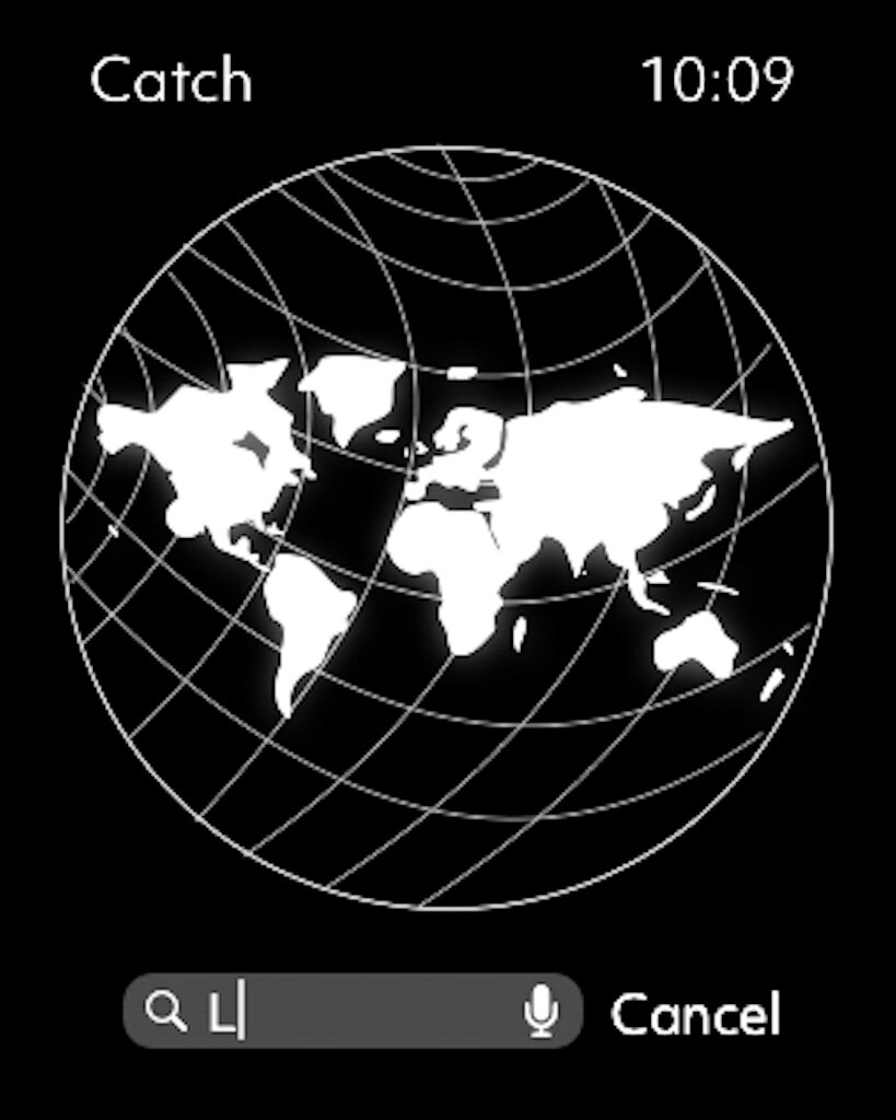
Design Outcome: Catch connects the surf community while educating users at all surf levels. Surfers can receive personalized advice from advanced ITO technology during their time spent in the water.
User Research
Through a series of primary research, I decided to focus on the user’s pain points and needs when they are searching for a perfect wave. As a surfer myself with connections, I conducted phone interviews and supervised surfers in the water upfront to understand their behavior in the ocean.
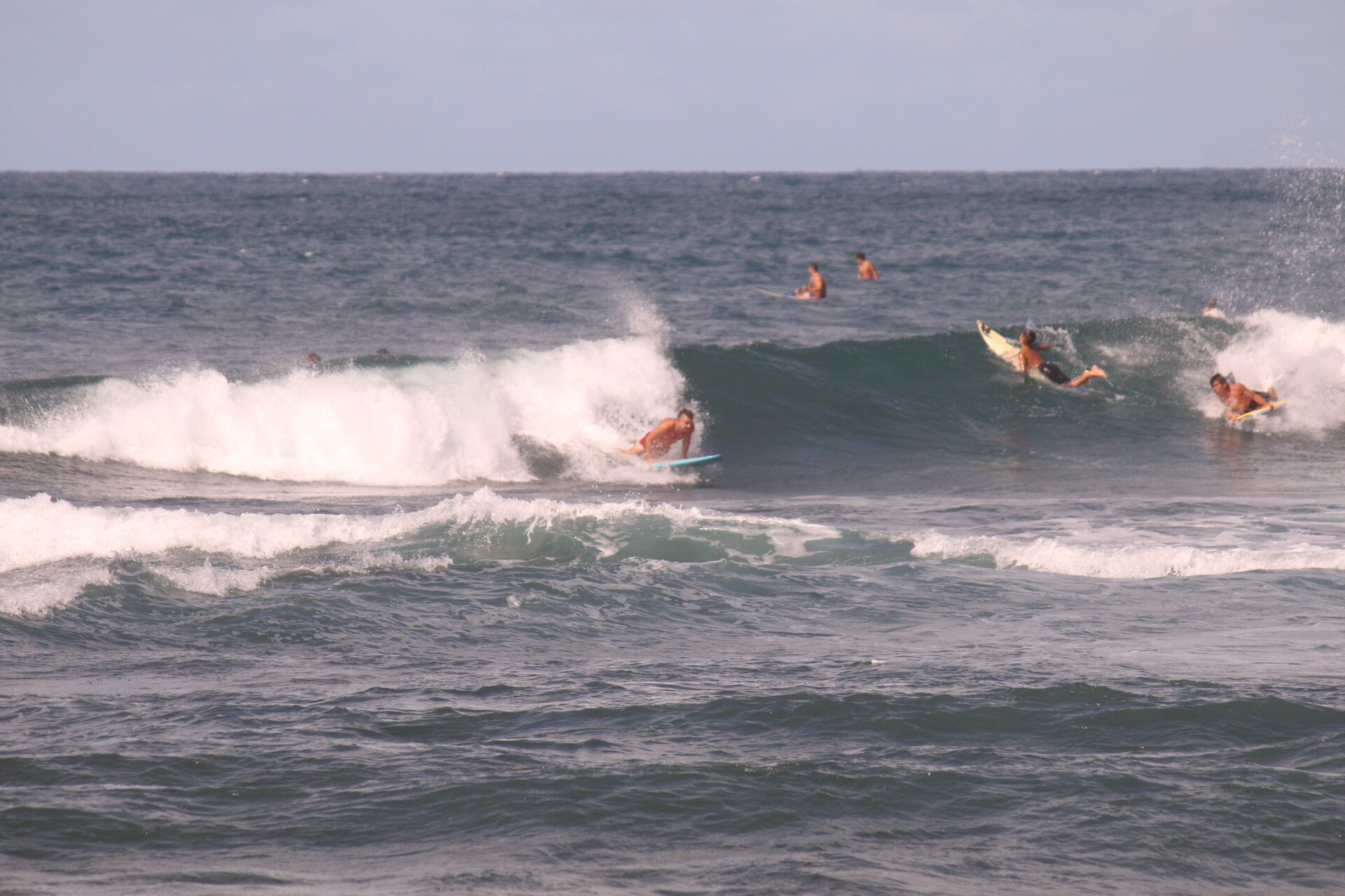
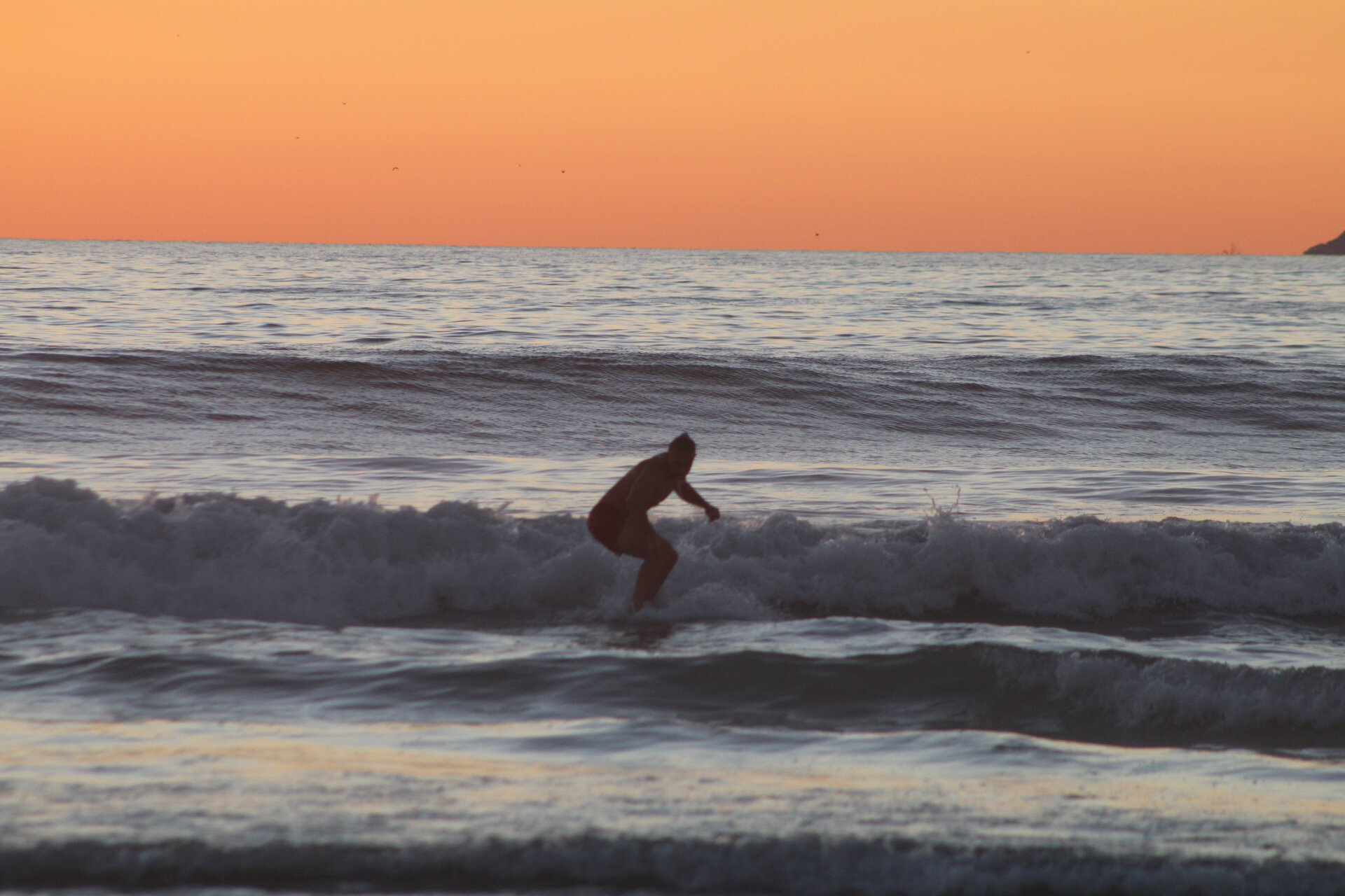
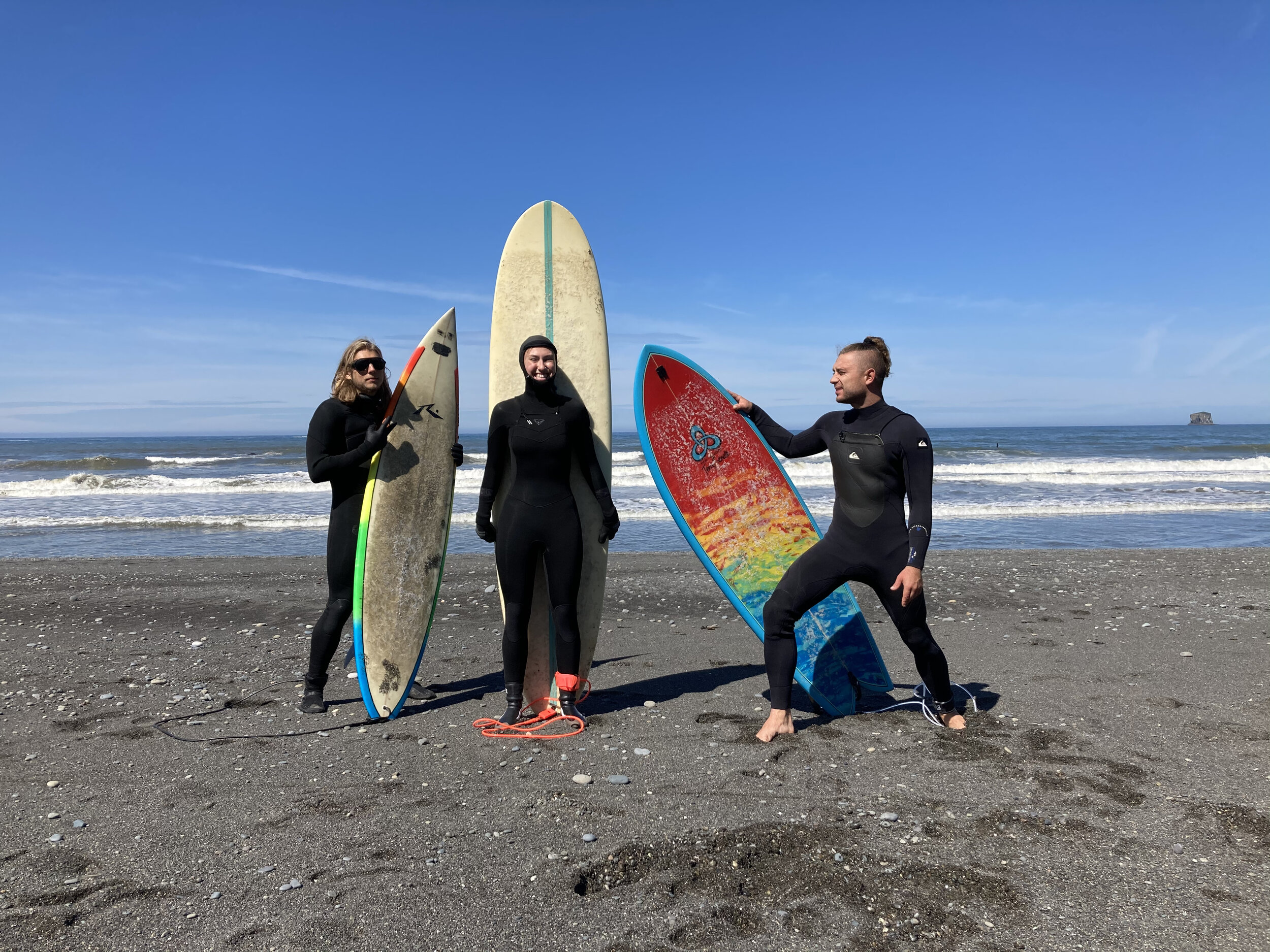
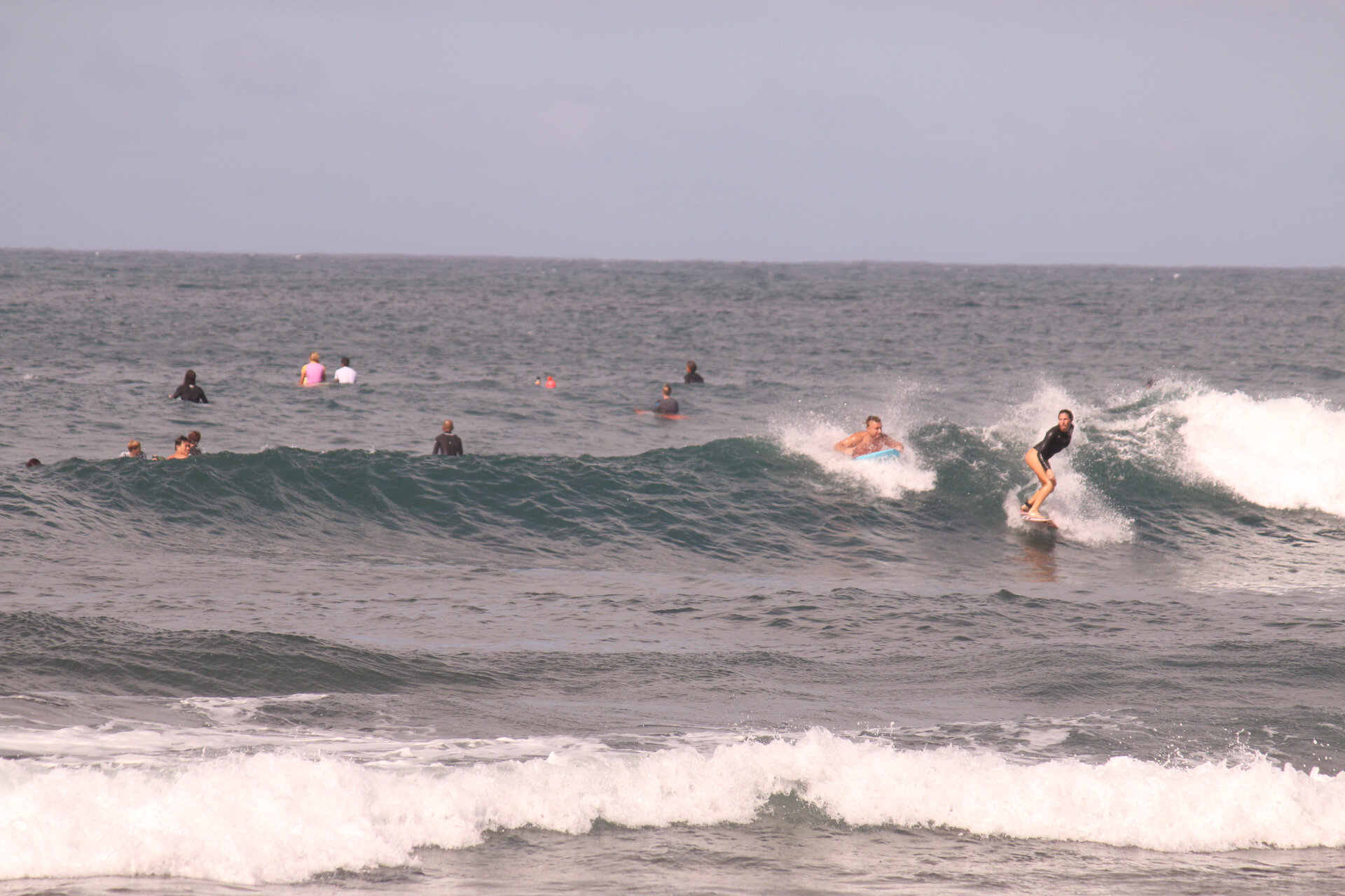
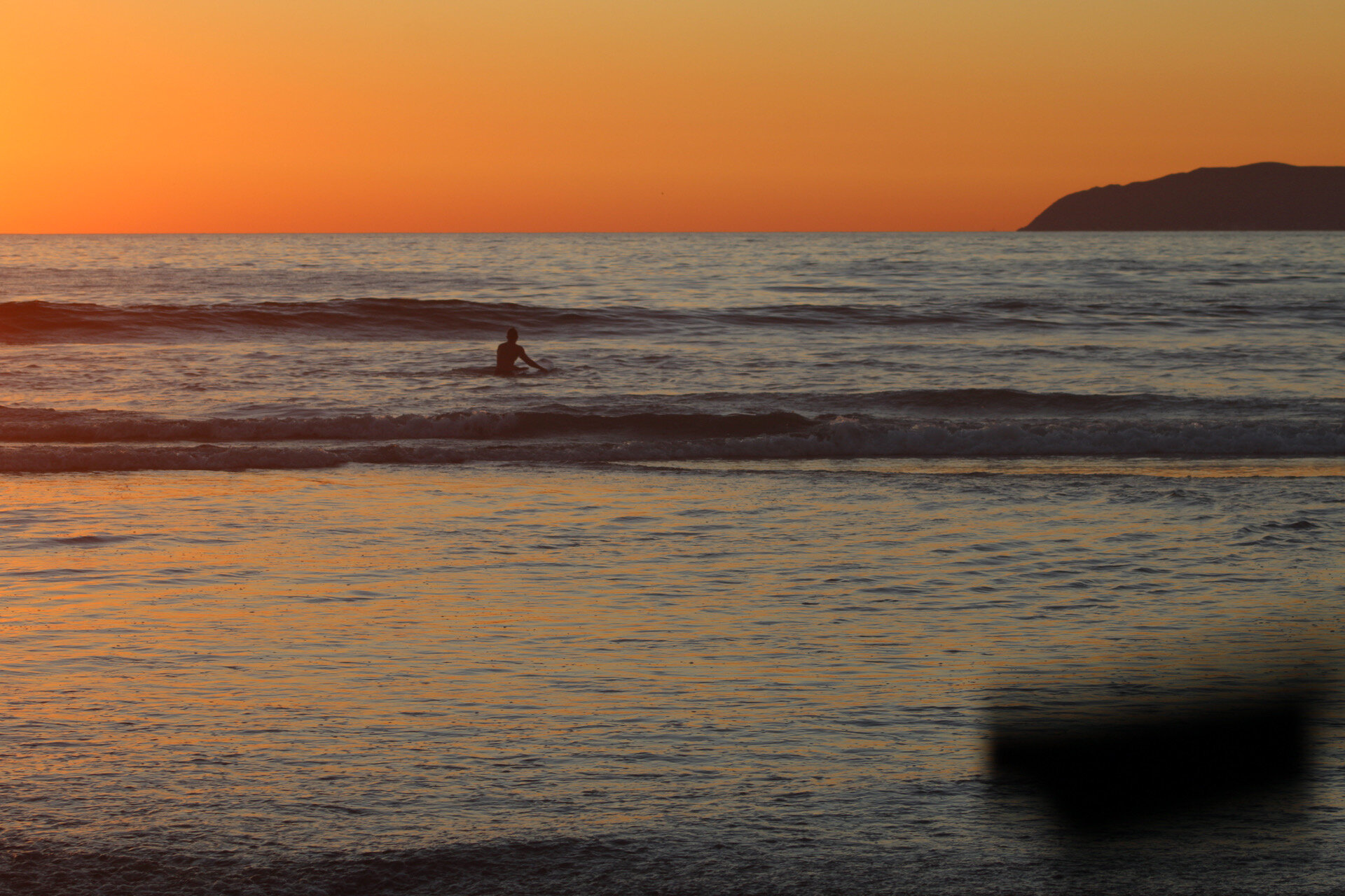
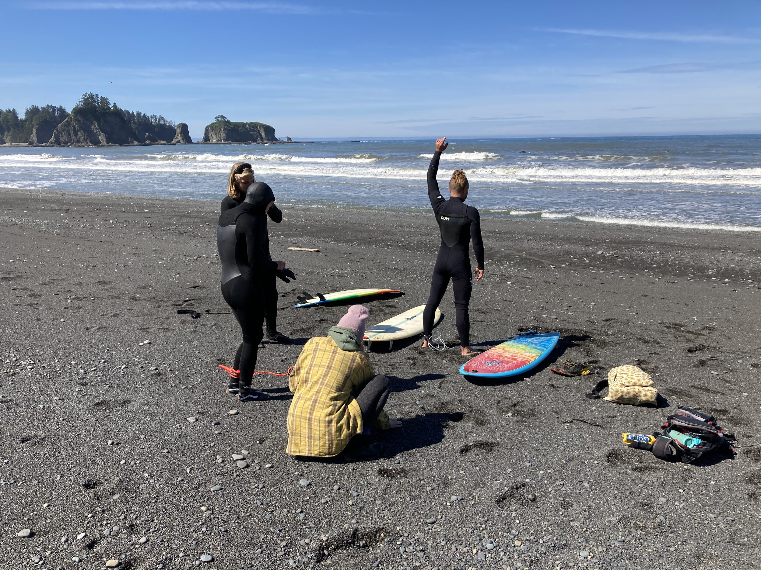
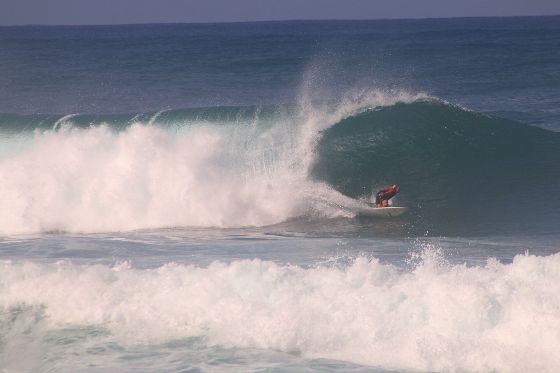
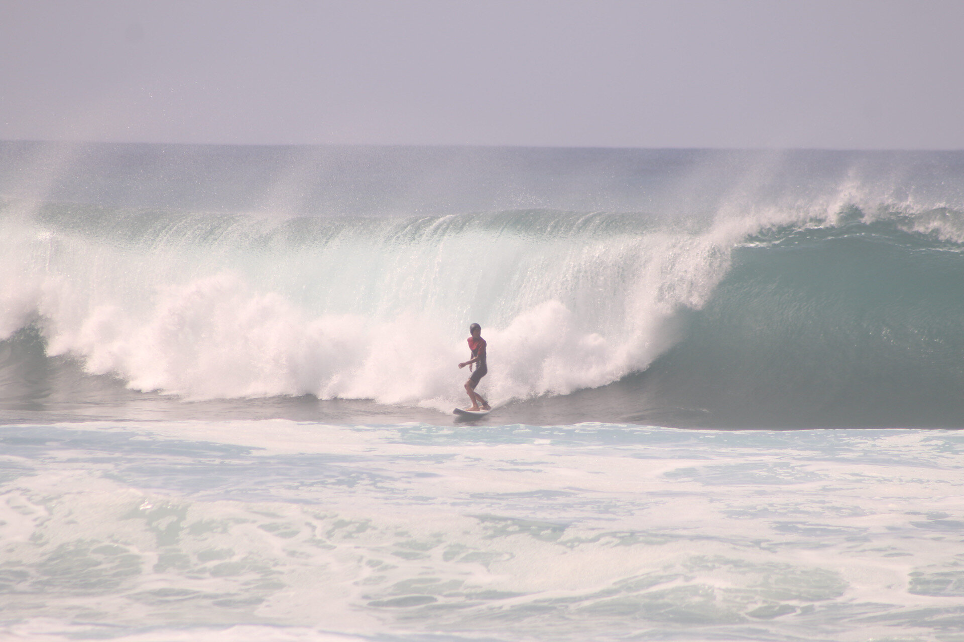
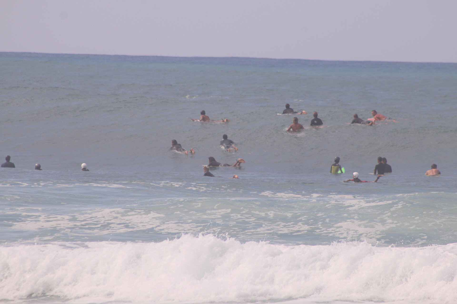
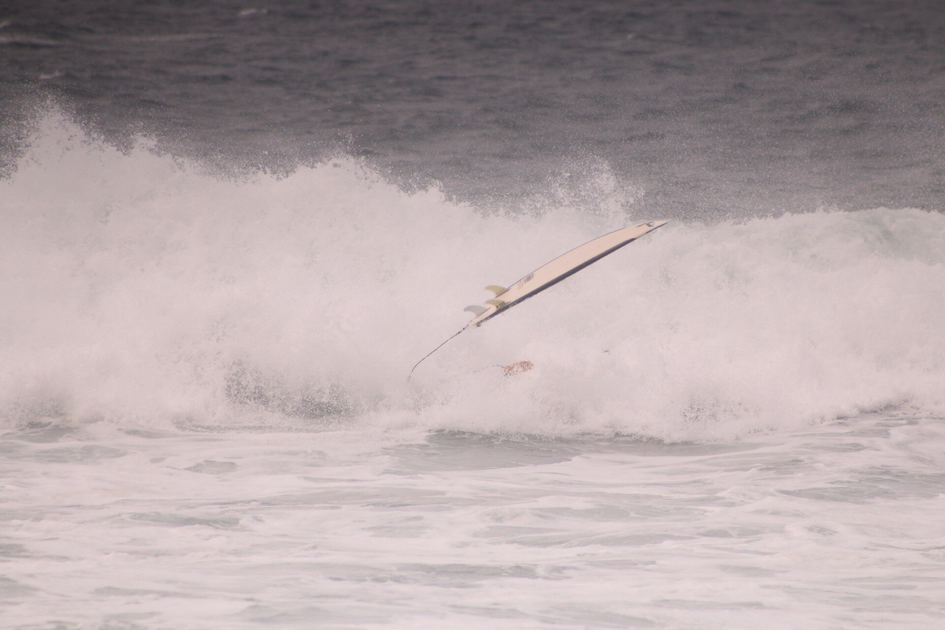
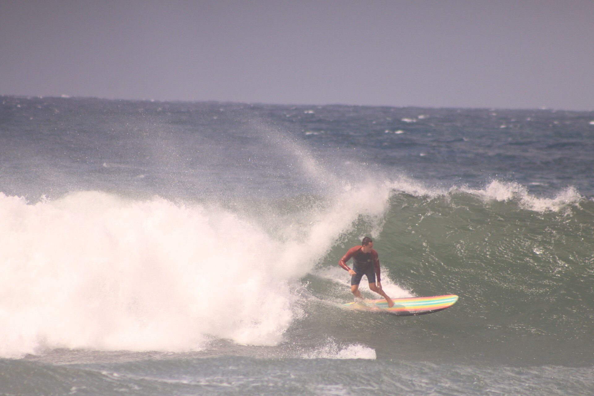
Field Observations: I surfed at four surf locations to observe surfers in the process of catching a wave. La Jolla beach in SoCal, Baja Mexico, Haleiwa in North Shore Hawaii, and Rialto Beach at the Washington peninsula.
I observed how surfers chose to position themselves for where to paddle and catch the swell. I analyzed how the surfers interacted with the changes in swells depending on low tide and high tide. I wen’t through the entire process with fellow surfers on observing the water, paddling out through the channel, positioning yourself where the swell breaks, and catching the wave.
Task Analysis: Based on the data I collected through these field visits and the exploration of finding the perfect swell, I created a task analysis for better understanding of the user’s pain points through different channels.
Interviews & Affinity Mapping: I conducted short-structured phone interviews with surfers who have apple watches. I also chatted with surfers at the various beach locations I visited to gage an understanding on the surfer’s struggles.
Key phone interview highlights:
“My biggest struggle is not knowing how the water is changing while I am in the water. Sometimes sneaker waves come in and knock you out.”
“Usually I eyeball the time & duration of the waves while I surf but that can difficult at times when waves are crashing on you. Sometimes you don’t know when there are crazy currents or weird water activity happening especially on days with poor visibility. ”
“Researching which swell fits my level can be time consuming sometimes. Sometimes I want to be able to connect with other surfers already at the beach so I can know if the conditions are even worth driving out to since I commute far to the beach. ”
“Sometimes I lose track of time out there in the water. It is important to remember to hydrate & reapply sunscreen for long surf sessions.”
Affinity mapping:
I synthesized my results using affinity mapping and gained the following insights:
Water conditions is the most important factor to consider when choosing which beach to surf; a beach with poor surf conditions can cause an unsuccessful surf experience.
Novice surfers usually don’t know what to consider when selecting a beach to surf.
Surfers from a tight community are usually willing to help each other out.
There are dangers in the water that surfers want to be aware of, even if the surf is looking decent for the swell.
Health stability is important for surfers to succeed and be able to last longer in the water.
Surfers are generally reluctant to drive out too far beaches from their location if the swell is not good conditions. Such selection requires careful research beforehand, & people generally use mobile phones to conduct this research.
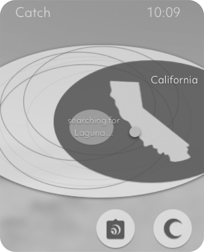
As a result, I decided to focus on Catch being an Apple Watch tool for surfers to access while they are in the ocean.
Personas: I created the following personas based on the data gathered from phone interviews and field observations. Since I decided to focus on designing in the Apple Watch interface, I created personas for users who utilize the watch.
Journey Mapping:
Competitive Analysis: To further understand the problem I was trying to solve for the users, I researched whom other competitors are trying to solve the same problem. I focused on the top 5 platforms; Surfline, MSW Surf Forecast, Tides Near Me, Dawn Patrol, & Windfinder.
Design
Ideation: I decided to sketch out design ideas individually before coming together and presenting my ideas to my user stakeholders. Each stakeholder referred back to the users needs I had identified in the research stage to make sure the solutions I came up with were addressed for the users needs. Below are some individual sketches.
Concept 1: In my first concept, I designed the screens with features that best fit the users need based off my synthesized analysis in my research above. This concept allows users to better understand and effectively find which beach they are searching for and the conditions of the waves. I also focused on creating a conditions screen for the user.
Concept 2: In my second concept, I provided the users with more detailed map geo finding and health capabilities to connect to the Apple Watch health functionality. This concept helps users find swells by bringing the essential swell conditions front and center so the surfer can have an understanding if the beach is worth paddling out or not. Furthermore, I dived into creating a surf track time session, so the user can keep a catalog of their experience in the Apple Watch.
Wireframes: I created the following wireframes in order to illustrate the basic functionality of the final design. The emphasis at this stage is still on functionalities rather than visual design, since my hope is to make sure the final design meets the users needs before refining the interface.
Concept 1 Wireframe: In this concept, I focused on designing the users basic needs which was geo location, conditions, water scan ability, and surf track time.
Concept 2 Wireframe:
Prototype 1: Based on user feedback, this first prototype received critiques on the colors not being visible while using in the ocean. The users requested that the prototype have more contrast with the ocean colors so the screens would be easy to use while surfing.
I also received feedback on the conditions needing more clarity and the map being too busy for the user. I worked on redesigning those screens to become more simplistic and concise.
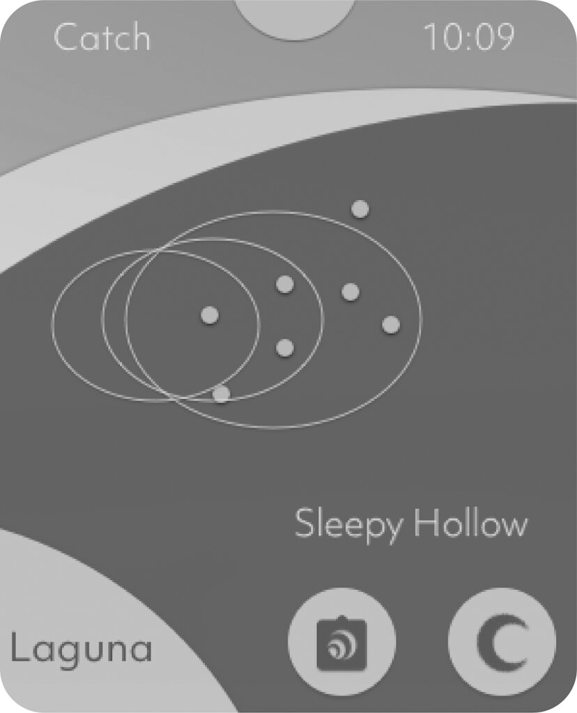
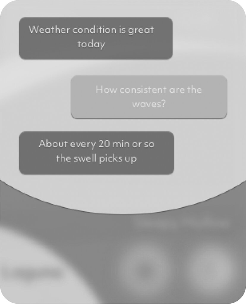
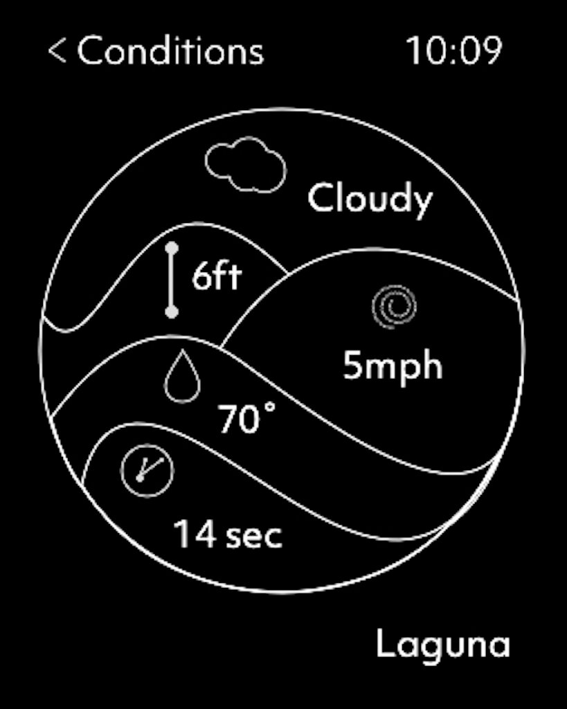
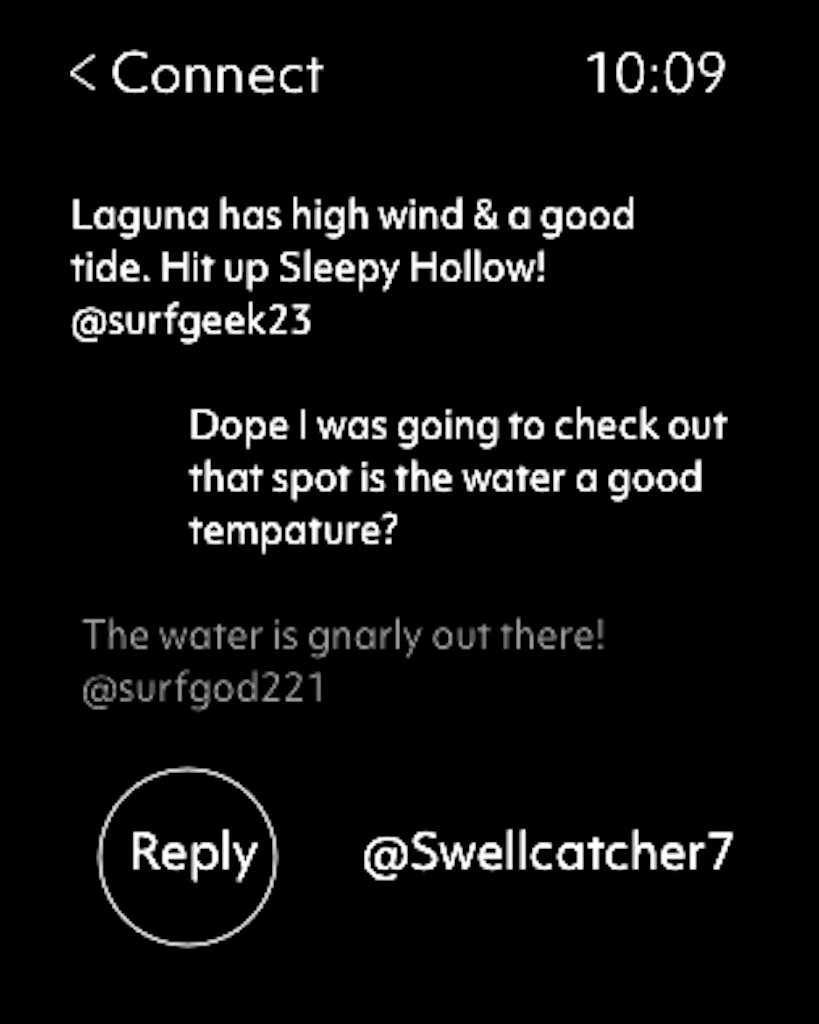
Prototype 2: I designed the second prototype to be minimalistic and user friendly based off of previous feedback. This design focused on the detailing of the conditions and educating the user through community connection.
Final Product
Features
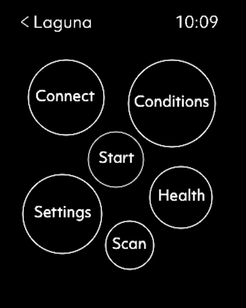
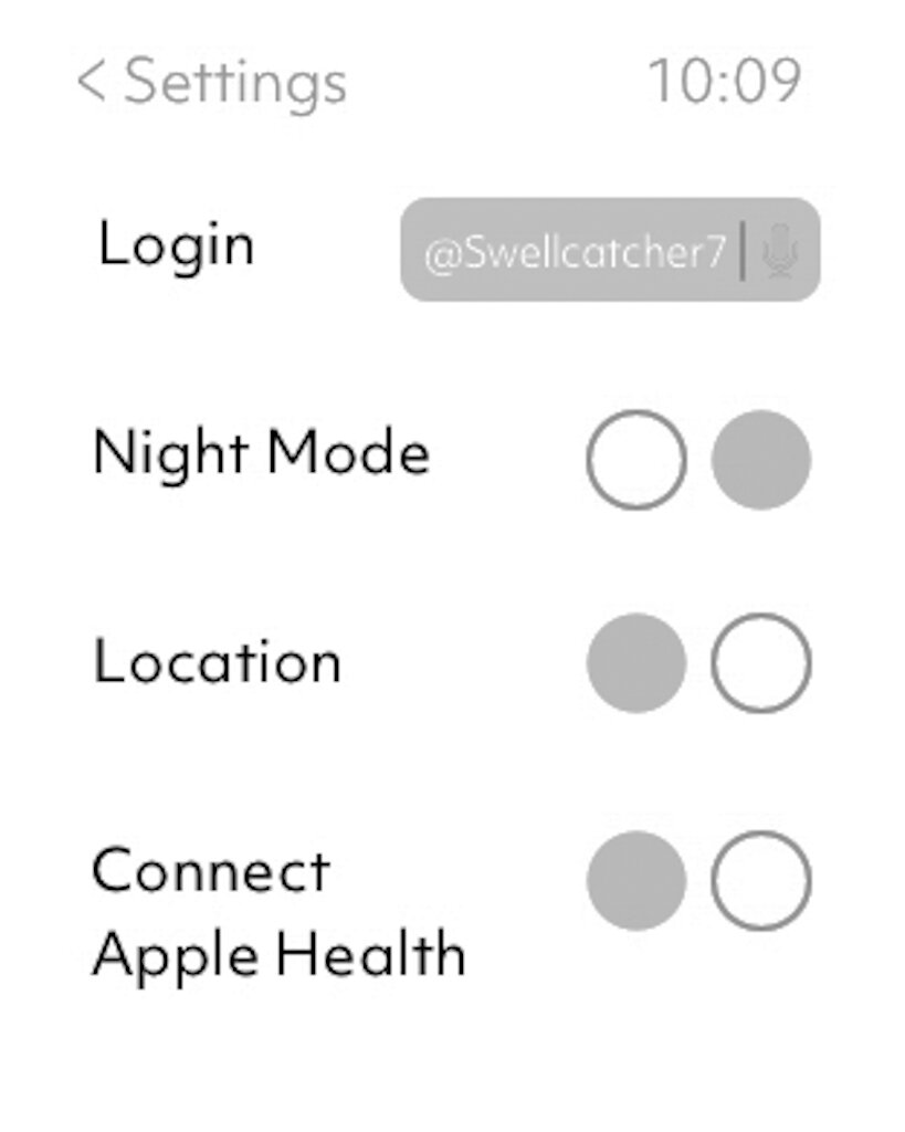
Settings allow for the app to be viewed in night function for evening surf time.
• Login with user functions to keep track of your data & connect with the surf community.
•Connect the GPS location for surf data accuracy on conditions.
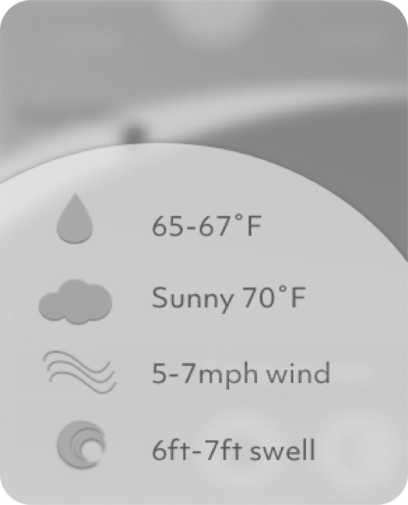
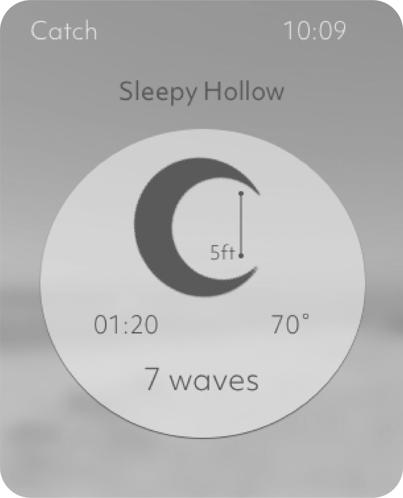
Real updated data on swell duration, weather, wave height, wind, and water temperature.
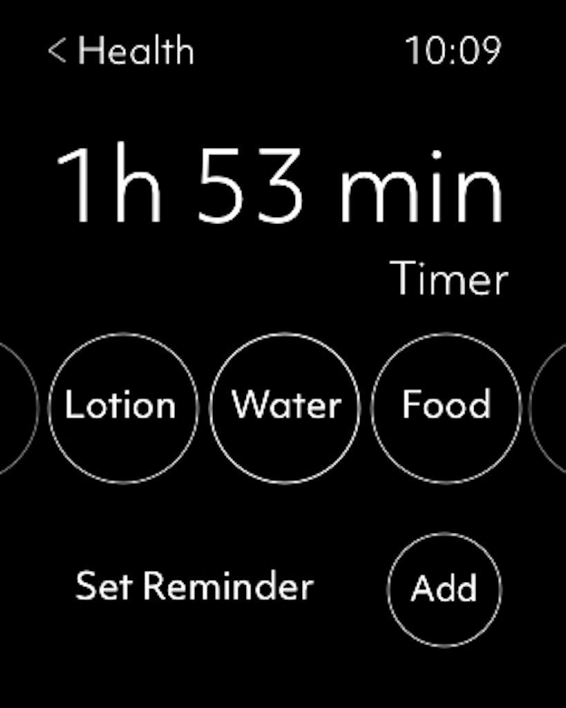
Connects surfers globally for a community experience have reminders for re-upping on hydration and sunscreen.
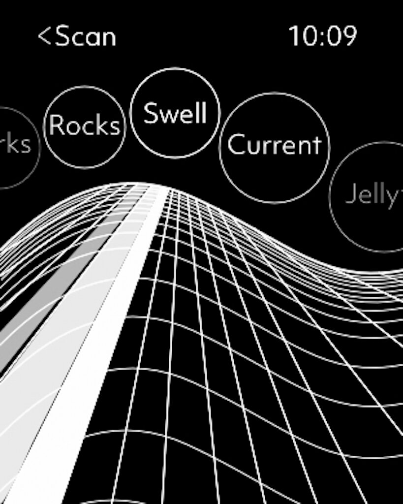
Advanced ITO using AR functions to create a safe surf experience especially at night time.
Evaluate
Cognitive walkthrough: To evaluate the user flow of the app, I conducted cognitive walkthrough sessions with usability experts. I hoped to make the user flow, when translated into a digital survey, intuitive and easy to follow.
Each session, the user was provided with the context of the design and a task to guide their evaluation. I showed them the interface and walked them through the tool step by step.


